Guided Self-Service Analytics: A Practical Guide
Self-service BI keeps breaking. Guided self-service fixes it: the data team designs the path, business users move freely within it. Here's how.

Most BI buyers have bought self-service three or four times by now. It's the promise every analytics vendor has made for 20 years: give business users the keys, let them answer their own questions, free up the data team for bigger work. And yet most of these rollouts fade inside six months. Adoption stalls in the 20% range. The same teams that championed the project end up back in Excel, or back in the analyst's ticket queue, or both.
The problem isn't the tools. It's the model. Every self-service approach so far has chosen one of two extremes: lock everything down and become the bottleneck, or open everything up and watch governance collapse. There's a third path, and it's the one that actually works. We call it guided self-service.
The shift is simple to describe and harder to deliver. Your data team designs the experience. Business users move freely within it. Nobody hands anybody a blank canvas. Nobody waits in a queue.
This piece is about what that looks like in practice — why self-service keeps failing, what guided self-service actually means, the four things it depends on, and how to roll it out without setting fire to your existing analytics stack.
TL;DR
- Self-service BI has been promised for two decades and mostly broken. It either locked everyone out or opened everyone in and lost governance.
- Guided self-service is the third option: the data team designs the path, business users explore within it.
- It depends on four things — a real semantic layer, governed exploration patterns, no-code analytical depth, and safe iteration for builders.
- Rollout works in five steps. Start with one team, usually finance.
- Astrato is built around this model from the ground up.
Why self-service BI keeps breaking
Talk to any BI leader who's been in the seat for more than a few years and you'll hear the same story. They've bought self-service before. It worked for a quarter, maybe two. Then governance fractured, dashboards multiplied, and the data team became more of a bottleneck than they were before the tool arrived.
There are three reasons this keeps happening.
Failure mode one: lock it down
The most common reaction to a previous bad experience is to centralize. IT owns the data, the models, the dashboards. Every new question becomes a ticket. Business users wait days for a chart that takes the analyst ten minutes. Adoption never crosses 20% because the friction is too high. Self-service in name only.
Failure mode two: open it up
The swing in the other direction looks great in the rollout meeting. Everyone gets a license. Everyone can build dashboards. Six months later, Marketing has one definition of conversion rate, Finance has another, and Sales has a third. The CEO asks a simple question and gets three different numbers from three different decks. Nobody trusts the data anymore. People go back to Excel — at least there, you know whose number you're looking at.
Failure mode three: clever UX, no model
This is the newer one. A wave of self-service tools tried to fix the problem with interface design.
- Sigma made it look like a spreadsheet.
- ThoughtSpot made it look like Google search.
- Metabase made it look easy to start.
All three handed business users a smarter front door. But behind the door, nothing changed. The user still has to pick the right dataset, the right metric, the right time window. They still have to know what "revenue" means in this context. The UX is friendlier, but the cognitive load is the same. So they ask the data team anyway.
These three failure modes share one root cause:
They all treat self-service as a question of access — who can get to the data — when the real question is design.
Who decides how the data should be explored, and how the exploration is shaped.
Guided self-service: a third path
Here's the reframe.
Guided analytics, in the old definition, is what happens when the data team builds the entire dashboard end-to-end. Users consume what they're given. Fast to deliver, low ceiling. Useful for executive reporting, terrible for ad hoc questions.
Self-service, in the old definition, is what happens when you give business users a blank canvas. High ceiling, brutal failure rate. Most users never reach the ceiling, and the ones who do create the governance chaos described above.
The dominant framing in the industry treats these as opposites. You pick one. We think that framing is wrong.
Guided self-service is what happens when the data team designs the path, and users move freely within it. The model is governed. The metrics are defined. The available dimensions, the navigation flow, the dashboards users land on — all of it is shaped by people who know the data. But once a user is inside that experience, they aren't reading a report. They're exploring. They can filter, drill, slice, ask the next question. The data team didn't predict the question; they designed a space where the question is answerable.
This is the wedge against the spreadsheet metaphor, the search metaphor, the blank canvas metaphor. All three give business users tools. Guided self-service gives them a designed experience.
Astrato gives your data team the governance controls they need, and your business users an experience simple enough to actually use.
That line sounds like marketing, but it's actually a description of an operating model. The data team owns the design. The users own the exploration. Neither owns the other's job.
What it actually takes to deliver guided self-service
Four things have to be in place. Each one fails on its own. Together, they're what makes the model work.
A semantic layer that everyone agrees on
Without this, nothing else matters. The semantic layer is the place where business terms get their definitions. Revenue means one thing. Active customer means one thing. Quarter-over-quarter growth uses one calculation. Once these definitions are written down in a layer that every dashboard and every user inherits from, the "three versions of the truth" problem stops being a problem.
The semantic layer isn't a chart.
It isn't a dashboard.
It's the thing underneath all the charts and dashboards.
When a user filters by region or drills into a product line, the semantic layer is what makes sure they get the right number. When a new dashboard goes live, it inherits the same definitions as every other dashboard. When something changes — a fiscal calendar shift, a new product hierarchy — the change happens once, and propagates everywhere.
There's a whole separate piece on this, and it's worth reading if you want the deep version of the argument. The short version: guided self-service is impossible without a real semantic layer. Not a layer of saved SQL queries. Not a folder of "certified" dashboards. A modeled, governed, inspectable layer that sits between the warehouse and everything users see.
Governed exploration patterns
Once the model is in place, the question becomes how users actually move through it. The old answer was "give them filters and hope for the best." Modern guided self-service is more deliberate.
Drill-down lets users move down a hierarchy without leaving the dashboard. Region into country into store. Category into product line into SKU. The hierarchy is part of the model, so the drill is consistent — no user invents their own path.
Drill-through lets users change perspective entirely. From a regional sales dashboard into a customer-level view. From a campaign summary into the underlying lead list. The destination is governed; the user chose to go there.
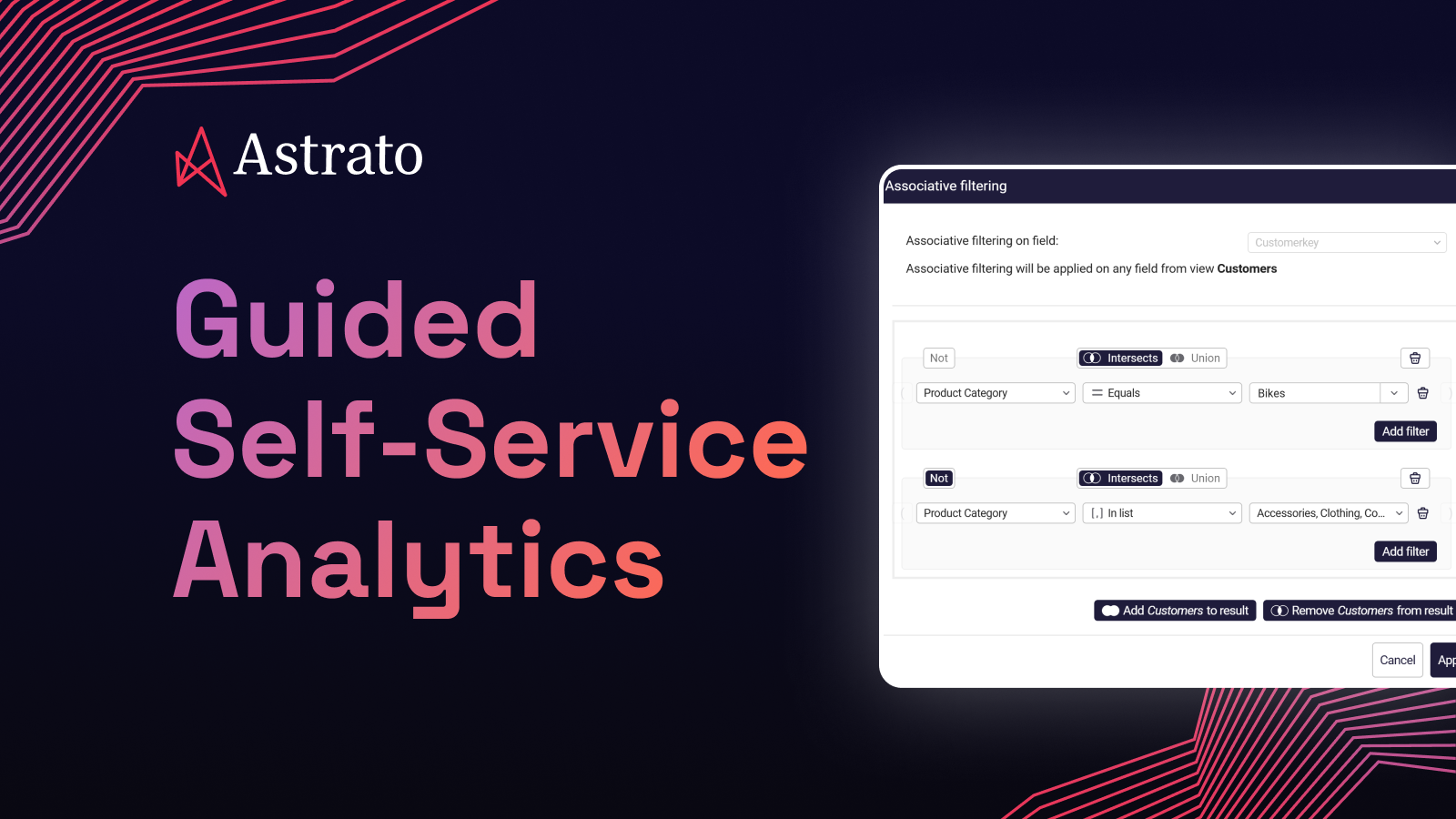
Associative filters let users ask the kind of question that legacy BI can't answer in a single click.
? Customers who bought running shoes but never bought socks.
? Products that succeed in Europe but fail in the US.
? Employees who know Python and SQL but not Scala.
These are real business questions, and in most tools they require an analyst to translate them into queries. Inside a guided experience, they're a few clicks.
The point of all three: business users dig deeper without the data team having to anticipate every question. The exploration is open-ended, but the rails are real.
No-code analytical depth
This is where most self-service tools quietly give up. To make things easy, they make them shallow.
Sums and averages.
Maybe a percentage change.
Anything harder — period-over-period comparisons, running totals, moving averages, percentile-based segmentation — and you need to write SQL or hand the question to an analyst.
That defeats the purpose. The questions business users actually ask are not shallow.
- A finance director comparing Q2 this year to Q2 last year doesn't want a tool that can only show the absolute number.
- A sales leader wants to know which products are climbing the rankings, not just which products are biggest.
- A customer success manager wants the moving average of churn, because the daily numbers are too noisy to act on.
Guided self-service means business users can do that level of analysis without writing code.
The calculations live on top of the semantic layer, so every period-over-period and every rank and every running total inherits the same governed definitions. Power without the pain, with consistency baked in.
When Impensa set out to build CostCloud — a healthcare supply chain platform that benchmarks millions of medical supply items against contract data — co-founder Dave Beto was clear about what they didn't want.
"We realized quickly that we needed a scalable SaaS application, not another reporting tool," he says.
The combination they landed on, Snowflake plus Astrato, gave them the analytical depth without the engineering cost.
"For me, Astrato was perfect. There's no coding, it's drag-and-drop, and it's rich in functionality."
From design to fully operational platform: 60 days. One and a half people.
"We can now process a customer's data and build actionable analytics in hours instead of weeks."
Safe iteration for builders
The fourth enabler is the one most discussions of self-service skip entirely, and it's the one that determines whether a rollout survives past month six.
The data team can't be afraid to change things.
New metrics get defined.
Old dashboards get retired.
Models get refactored as the business evolves.
If every change risks breaking production for live users, the team will stop making changes. The semantic layer goes stale. The experience users have today is the one they'll still have in two years, even when the business has moved on.
Versioning fixes this. Drafts let the data team experiment in private. Stable versions get published. If something goes wrong, roll back. Role-based permissions decide who builds and who consumes. The data team gets to iterate without fear; users get a stable experience.
This is unglamorous infrastructure. Nobody buys a BI tool because of its versioning model. But the rollouts that survive long-term are the ones where the data team can change things safely.
IAG Loyalty (home to Avios) has seen this play out at scale. After moving to Astrato on top of Snowflake, time-to-insight dropped from weeks or months to days or hours, and the team shipped 280 dashboard updates to users in under twelve months.
"Our data colleagues love Astrato's reusability and ease of use," says Chanade Hemming, Head of Data Products. "Business colleagues love the speed, performance, and ability to see iterations sooner and safer."
One in three monthly users now uses Astrato daily — the kind of adoption number most self-service rollouts at this scale never reach.
Five steps. None of them are radical. The trick is doing them in this order and resisting the urge to skip ahead.
1. Centralize the data
There's no guided self-service if the data lives in seven systems. Snowflake, BigQuery, Databricks, Redshift, Supabase, whatever the warehouse is, the core business data needs to be there.
Not copied, not extracted, not synced overnight to some intermediate cube.
Live in the warehouse, queryable.
If your BI tool is still pulling data into its own proprietary store, you've already lost the consistency battle.
2. Define the metrics that matter
Don't model everything. The instinct is to spend six months building the perfect semantic layer that covers every possible question. That project never ships. Instead, list the ten KPIs your business actually argues about. Revenue. Churn. Conversion rate. Active customers. Whatever they are.
Define those ten in the semantic layer first. Get them right. Get the business to agree on the definitions. That's your foundation. Everything else comes later.
3. Design the paths, not the dashboards
This is the step most teams miss, and it's the one that separates guided self-service from the old guided-analytics model.
Sit with a finance director and watch how they answer a typical week's questions. Map the questions, not the screens. "What's our pipeline by region" leads to "which deals slipped" leads to "what's the win rate by sales rep" leads to "which products are in the slipping deals." That's not one dashboard. That's a path.
Design the path.
- Decide which questions surface first.
- Decide which dimensions are available at each step.
- Decide where the user lands when they drill through.
The dashboard is the artifact; the path is the design.
4. Pilot with one team
Finance is usually the right first team. Metric ownership is clearest. The pain is sharpest. Once finance is running on a guided self-service model with the top ten metrics defined and a few well-designed paths, the rest of the business will see it and ask for the same. Expand from there.
Don't try to roll out to ten departments at once. The model takes a few months to settle, and you want the lessons from one team's rollout before you bring on the next.
5. Iterate with versioning
Once the pilot is live, new questions will surface. The metric definitions you nailed down in step two will need refinement. New paths will become obvious. New dimensions will need adding.
- Use draft/publish flows to roll changes out safely.
- Communicate what's changing.
- Keep the audit trail.
The team that iterates well in months six through twelve is the team whose adoption keeps climbing.
What guided self-service looks like by role
The model is the same; the experience is different depending on who you are. Three quick sketches.
Finance
Finance teams live in period-over-period comparisons. Quarter against quarter. Region against region. Plan against actual. A guided self-service experience for finance puts the income statement and the variance analysis front and center, lets them drill into the lines that moved, and gives them the analytical depth (running totals, rolling forecasts, percentile rankings) without exporting to Excel. The metrics are defined once in the semantic layer, so when Finance and Marketing disagree about revenue, they can both inspect the formula and the argument ends.
Product
Product teams want to understand behavior. Feature adoption, retention, conversion funnels, cohort analysis. A guided experience for product teams puts the core funnel and engagement metrics up front, lets them slice by user segment or cohort or plan tier, and supports the kind of associative filtering that answers questions like "users who activated feature X but never used feature Y." Nothing in here requires SQL.
Marketing
Marketing teams chase attribution. Which campaigns drove pipeline. Which channels delivered ROI. Which content moved leads from cold to warm. A guided experience for marketing connects the campaign performance data, the funnel data, and the revenue data in one place, with shared definitions of every metric. Marketing's ROI argument with Sales becomes a conversation about strategy, not a debate about whose numbers are right.
Where guided self-service rollouts go wrong
Three pitfalls show up often enough to flag.
Over-modeling upfront
Teams spend six months building the perfect semantic layer before any user sees it. By the time it ships, the business has moved on and the model is stale. Start with the ten metrics that matter. Iterate.
Skipping path design
Teams nail the semantic layer, ship a powerful BI tool to business users, and watch adoption flatten. The model is good; the experience is a blank canvas. The user still doesn't know where to start. Path design is the work between the model and the user.
Treating it as a tool purchase
Guided self-service is an operating model, not a product. It changes who owns what. The data team becomes a design team for analytical experiences. The business becomes the explorer. If the rollout is framed as "we bought new BI software," the operating model never shifts and the rollout fails the same way the last one did.
From self-service to guided self-service
The promise of self-service BI was always good. The execution failed because the industry kept choosing between two bad models — lock it down, or open it up — and treating clever UX as a substitute for design.
Guided self-service is the unlock. The data team designs the path. Business users move freely within it. The semantic layer keeps the numbers honest, the exploration patterns keep the rails real, no-code analytical depth keeps the questions deep, and versioning keeps the whole thing iterable.
The companies that figure this out spend less time arguing about which dashboard is right and more time acting on what the data says.
Key takeaways
- Self-service has failed for 20 years because the industry kept picking between locking everything down and opening everything up.
- Guided self-service is the third path: the data team designs the experience, business users move freely within it.
- Four things have to be in place — a real semantic layer, governed exploration patterns, no-code analytical depth, and safe iteration for builders.
- Roll out in five steps: centralize the data, define the metrics that matter, design the paths, pilot with one team, iterate with versioning.
- Start with finance. Clearest metric ownership, sharpest pain, fastest signal that the model works.
See it in action
If you've been through one of the failed self-service rollouts described above (or two, or three), the model in this piece probably resonates more than the marketing on most BI vendor sites does. Astrato was built around guided self-service from the start. Live-query directly to your warehouse, a semantic layer everyone inherits from, governed exploration patterns, no-code analytical depth, and the versioning to let your data team change things without breaking anything.
Book a demo and we'll walk through what guided self-service looks like for your team specifically. Or explore the product page to see the model laid out in more detail.
Frequently asked questions
What is guided self-service analytics?
Guided self-service analytics is an operating model for BI where the data team designs the analytical experience — the semantic model, the available metrics, the exploration paths — and business users explore freely inside that design. It combines the consistency of traditional guided analytics with the autonomy of self-service BI. Users don't wait in a queue, but they also don't get a blank canvas.
What's the difference between guided analytics and self-service analytics?
Most of the industry frames these as opposites. Guided analytics traditionally means the data team builds dashboards end-to-end and users consume them — high consistency, low flexibility. Self-service traditionally means users build their own dashboards from scratch — high flexibility, low consistency. Guided self-service unifies the two: the data team designs the path, users move freely within it.
Why has self-service BI failed for so many companies?
Three reasons. Some rollouts centralize too much and become the bottleneck they were meant to remove. Some open up too much and lose governance, ending up with three definitions of every metric. And a third group buys tools with clever UX (spreadsheet metaphors, search interfaces, simple-start tools) without changing the underlying model — so the user still has to know which dataset, which metric, which time window. They default back to asking the data team.
What is governed self-service BI?
Governed self-service BI means business users can explore data freely while inheriting central governance — metric definitions, access controls, audit trails, row-level security. It's a precondition for guided self-service. Without governance baked in, self-service becomes the "three versions of revenue" problem within a quarter.
How do you implement self-service analytics?
Five steps. One: centralize the data in a cloud warehouse. Two: define the ten metrics your business actually argues about, in a semantic layer. Three: design the exploration paths users will take, not just the dashboards they'll land on. Four: pilot with a single team — finance is usually the right starting point. Five: iterate with versioning, rolling out changes safely as the model matures.
Ready to experience next-gen analytics?
See how Astrato runs natively in your warehouse.