Sankey Diagram Use Cases: When to Use One in Modern BI
A practical guide to Sankey charts in BI — use cases that justify one, when a bar chart wins instead, and why live-query Sankeys matter for operational workflows.


The marketing lead wants to see where 200,000 visitors went between landing and checkout, and at which stage the drop-off concentrates. The CFO wants one image that turns gross revenue into net profit, with every leakage point sized to scale. The hospital operations director needs to see how patients move from triage through specialist referral to discharge, across departments, over a quarter. The product manager wants to know which feature paths users actually take, not the ones the spec assumed.
Each of these is the same chart problem. A flow between stages, with the size of each flow proportional to its weight, branching and recombining through the diagram, and the magnitude of each path readable at a glance. None of them is a bar chart. None of them is a pie chart. All of them are Sankey diagrams.
This article is for the analyst or BI lead choosing the right visualisation for a flow problem — and for the data team being asked "can we add a Sankey here?" and deciding whether the answer is yes, no, or "yes, but not the way you mean." You'll get six use cases worth a Sankey, four anti-patterns where a different chart wins, the technical thing live-query architecture changes about Sankeys in production, and the practical mechanics of building one in Astrato over your warehouse data.
TL;DR
A Sankey diagram is a flow diagram where the width of each link is proportional to the quantity flowing through it. Use one when you're showing flow between stages, attribution across sources, or volume splitting and recombining across a process.
Important: Don't use one for time-series, small datasets, or simple part-to-whole comparisons — a bar chart, line chart, or treemap will out-read a Sankey every time.
In production BI, the meaningful difference between a working Sankey and a broken one is usually whether the diagram queries the warehouse live or runs off an extract that's already stale by the time anyone opens the dashboard.
What a Sankey diagram actually is
A Sankey chart is a flow diagram for creating and visualising flows between your data. The chart or diagram displays the flow quantity proportionally—the wider the link, the greater the flow quantity. The chart is structured so that these links connect the different nodes or processes. The flows can be combined or split and traced through a series of stages or events to draw out potential business opportunities from the visualisation.
The chart is named after Irish Captain Matthew Henry Phineas Riall Sankey, who first used the form in 1898 to display energy efficiency in steam engines. The mechanics haven't changed in over a century. What has changed is the data behind it — modern Sankeys built in a cloud BI platform pull live datasets from the warehouse and update as the source data updates, which makes them useful for operational analytics rather than just retrospective reports.

A Sankey isn't the only flow visualisation. A chord diagram shows flows between categories that are peers (city-to-city migration, for example), not stages. A funnel chart shows a strict linear sequence with no branching. A graph (in the network-analysis sense) shows relationships without proportional weight. Sankeys are the right choice specifically when you have stages, branching flows, and weights worth reading by width.
Six use cases worth a Sankey
Each use case below has shown up in production dashboards we've seen at Astrato customers. The pattern is consistent: a flow problem that another chart type was hiding, made legible by a Sankey.
1. Marketing funnel and customer journey drop-off
The classic use case. A visitor lands on the site through one of several acquisition channels. They move through stages — landing page, product page, add-to-cart, checkout, conversion. Some convert. Some abandon. Some loop back. A bar chart per stage gives you the totals; a Sankey shows you which channel's visitors are abandoning at which stage, and where the funnel actually leaks.

The detail that matters: with a bar chart, "20% drop-off at checkout" is a single number. With a Sankey, you see that 80% of the checkout abandonment is from one paid channel, while organic converts cleanly. That's a chart that changes where the next quarter's budget goes.
This is the bridge into proper product analytics on Snowflake — the same flow visualisation, mapped over user events instead of session funnels, answers feature-adoption and path-analysis questions the same way.
2. Attribution and multi-touch conversion paths
Adjacent to the funnel case but distinct. Attribution asks the harder question: of the visitors who eventually convert, which combination of touches drove the conversion, and how much credit does each touch deserve? A Sankey lets you map first touch → middle touches → conversion, weighted by either visitor count or revenue, with the link widths exposing which touch combinations actually carry the business.
The chart replaces a multi-tab attribution report. It also replaces every argument about whether display ads "do anything" — the diagram shows the answer at a glance, and the team stops debating the methodology and starts arguing about the budget.
3. Energy, material, and manufacturing flow
The original 1898 use case, still the cleanest. Sankey diagrams visualise mass flows on a multi-machine production line, energy efficiency across a power station, water flow through a treatment plant, or feedstock conversion in a chemical process. The width of each link sizes the loss at each stage — heat lost, material rejected, energy not recovered — in a way no other chart matches.

If you're in manufacturing, utilities, or process industries and you don't have a Sankey live somewhere in your operational dashboard set, you're leaving a category of analysis on the table that doesn't have a substitute.
4. Patient flow and clinical pathway analysis
Healthcare uses Sankeys for two adjacent problems. The first is patient pathway — how patients move from triage through diagnosis, referral, treatment, and discharge, broken out by department or condition. The second is medication flow — which diagnoses lead to which prescriptions, and which prescriptions lead to refills versus discontinuation.

Both questions have the same shape: stages, branching, proportional weight. A Sankey makes a quarterly operations review legible to a board in a way a stack of cross-tabs cannot. NGHS, a US health system running Astrato over Snowflake, uses live-query analytics for exactly this category of operational question — the underlying patient and care data is sensitive enough that extracting it for visualisation creates governance problems the warehouse-native pattern avoids entirely.
5. Financial waterfall and cash flow
Finance teams use Sankeys to visualise revenue-to-profit waterfalls. Gross revenue enters on the left. The diagram splits it across costs of goods, operating expenses, financing costs, tax, and what remains is net profit on the right. Every leakage point is sized to scale. Cashflow Sankeys do the analogous thing — inflows on one side, outflows by category on the other, net position visible as the remaining width.

The reason this beats a stacked bar or a P&L table is intuition. A finance partner reading the Sankey instantly sees that, say, operating expenses are 40% of gross revenue and growing faster than revenue — a number that's true in the table too but doesn't punch in the same way.
6. Product analytics and user path analysis
The newer use case, and increasingly common in SaaS dashboards. A user enters the product through one of several routes — onboarding, deep link, referral. They take one of several paths through features. Some hit the activation moment. Some don't. Some come back. A Sankey of feature-to-feature transitions, weighted by user count, shows you which paths actually exist in your product versus which ones the design assumed.
The same diagram, weighted by retained users instead of sessions, becomes a retention diagnostic. The same diagram, filtered to free users, becomes a conversion diagnostic. One chart, three questions. This is the use case that benefits most from live-query against the warehouse — the answers change every day, and a daily-refresh extract loses the signal.
When NOT to use a Sankey
Four patterns where a Sankey is the wrong chart, even though the data superficially looks like flow. Naming them is the part most BI guides skip.
Time-series data
If the x-axis you want is time, you want a line chart, an area chart, or — for stage-by-stage progression over time — a small-multiple of bar charts. A Sankey collapses time into a single static picture. You can build one that shows period-to-period flow (Q1 customers becoming Q2 customers), but the moment you have more than three or four time periods, the diagram becomes unreadable.
Small datasets
A Sankey with five flows and three nodes is a diagram, not a chart. It conveys nothing a labelled bar chart wouldn't convey faster. The minimum useful Sankey starts somewhere around 8–10 nodes with at least 15 links between them; below that, the chart type is overkill.
Simple part-to-whole comparisons
"Revenue by region, this quarter" is a bar chart. Or a pie chart, if you must. Not a Sankey. Sankeys earn their complexity when there's branching and recombining; a single column of flows from one source to several destinations is just a stacked bar in disguise.
Flows without meaningful weight
If the link width doesn't carry information — if every flow is "1 unit" or every weight is roughly equal — the Sankey's whole reason for existing collapses. A network graph or a simple flow chart conveys the same information without the cognitive overhead of reading widths that don't matter.
The keeper line: a Sankey is the right chart when width is the answer. If the widths don't tell the story, you don't need a Sankey.
Why live-query Sankeys beat extract-based ones
The technical thing worth understanding. Most BI tools render Sankeys off an extract — the diagram you see in the dashboard was built from a snapshot of the warehouse, refreshed overnight or every few hours. For retrospective questions (last quarter's customer journey, this year's energy flow), that's fine. For operational questions (where are customers dropping off right now, how is this quarter tracking against the last), it isn't.
A live-query Sankey runs the SQL against the warehouse every time the dashboard opens. The diagram you're looking at reflects the current state of the data, not a snapshot from 9 hours ago. For a marketing team running a campaign, that's the difference between fixing a checkout problem today and learning about it tomorrow. For an operations team running production, it's the difference between catching a bottleneck in shift and reading about it in the post-mortem.
This is the same architectural argument that runs through real-time analytics on Snowflake — extracts add latency between the data and the analysis, and for any chart that informs a same-day decision, that latency erodes the chart's value. Sankeys are particularly sensitive to it because flow problems are usually operational problems, and operational problems don't wait for the overnight refresh.
Warehouse-native BI changes the rest of the production picture too. Row-level security from the warehouse carries through to the Sankey, so a customer-facing flow diagram in a multi-tenant SaaS product can show each customer only their own data without the BI tool having to enforce isolation itself. Governance lives in the warehouse, not in the dashboard. The chart inherits it. The deeper case for this is in legacy BI vs. cloud-native BI; the relevant point here is that a live-query Sankey is the same chart type, but a meaningfully different production object.
How to build a Sankey in Astrato
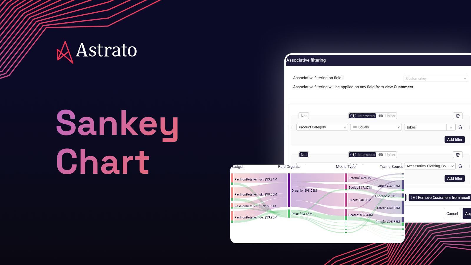
The mechanics are deliberately uncomplicated. The chart was added to Astrato's visualisation library in 2024 as a no-code, drag-and-drop visual — the same pattern as every other chart in the platform.
Step 1. Open a sheet in your Astrato app. From the chart picker, drag the Sankey chart onto the canvas.
Step 2. Point the chart at your data. A Sankey needs three columns — source (where the flow comes from), target (where it goes), and value (the weight). Astrato reads these directly from your warehouse view or semantic-layer object; no extract step, no data prep stage.
Step 3. Customize. Node colours, link opacity, sort order, labels, hover behaviour — all configured in the property panel, no code. Conditional formatting for nodes that exceed a threshold is one toggle.
Step 4. Publish or embed. The Sankey lives inside a dashboard or embedded analytics surface like every other Astrato visual. White-label styling, SSO pass-through, row-level security from the warehouse — all default. If you're embedding into a customer-facing product, this is the same architectural pattern that runs in production behind Astrato's embedded analytics for BigQuery and embedded BI for Databricks.
The Sankey can be cross-filtered like any other chart. Click a node, every other visual on the dashboard filters to the flows that touch it. That's the part most static Sankeys can't do — they're images. A live-query Sankey is an interactive object you analyse in real time.
Customer story: Peprr
Peprr, the customer journey measurement and first-party data platform, was an early adopter of the Astrato Sankey when it shipped. Their core product is journey analysis — for their customers, the Sankey is the chart that demonstrates the platform's value most directly. The Peprr ID stitches user activity across touchpoints; the Sankey makes the stitched journey legible.
The detail worth copying: Peprr ships the Sankey as part of an embedded analytics experience, white-labelled into their own product, running live against the warehouse. The same chart type — the one most BI tools render as a static image off an extract — is, in their stack, an interactive operational object that updates as their customers' first-party data updates.

See Sankeys working over your warehouse
Astrato is the warehouse-native BI platform for guided self-service, embedded analytics, and operational data apps. Sankey diagrams are one chart type in a library built for live-query analysis over Snowflake, BigQuery, Databricks, and the other warehouses your team actually uses. Book a demo or start a free trial to see Sankey diagrams, live-query architecture, and embedded analytics working over your own data.
FAQ
What is a Sankey diagram used for?
A Sankey diagram is used to visualise flow between stages or categories, where the width of each link is proportional to the quantity flowing through it. The most common uses are marketing funnel and drop-off analysis, multi-touch attribution, energy and material flow in manufacturing, patient pathway analysis in healthcare, financial waterfalls from revenue to profit, and user path analysis in product analytics.
When should you use a Sankey diagram instead of a bar chart?
Use a Sankey when the story is in the flow between stages, not the magnitude at each stage. A bar chart tells you how big each step is; a Sankey tells you which inputs produced which outputs and where the volume is leaking. If your question is "what is X?" use a bar chart. If your question is "where did X come from, and where did it go?" use a Sankey.
Can a Sankey diagram show data over time?
Not well. A Sankey collapses time into a single static picture, so it works for "this quarter's flow" or "this campaign's funnel" but not for "how flow changed week by week." For time-based progression, a line chart or small-multiple of bar charts is the right visualisation. You can build period-to-period Sankeys (Q1 customers becoming Q2 customers, then Q3 customers), but they become unreadable past about four time periods.
What's the difference between a Sankey diagram and a chord diagram?
A Sankey diagram shows flows between stages — the nodes are ordered left-to-right and the flow moves through them. A chord diagram shows flows between peers — the nodes are arranged in a circle and flows move between them in any direction. Use a Sankey when there's a clear progression (acquisition → activation → revenue). Use a chord diagram when the relationships are symmetric (city-to-city migration, contributor-to-contributor collaboration).
How many nodes can a Sankey diagram handle?
In practice, a Sankey starts to lose legibility past about 30–40 nodes, depending on link density. Below 8–10 nodes it's overkill — a bar chart or stacked bar conveys the same information faster. The useful range is roughly 10 to 30 nodes with at least one and a half times that number of links between them. Astrato's Sankey handles datasets in the millions of rows because the query runs in the warehouse; what limits the chart is human readability, not data volume.
Does Astrato support live-query Sankey diagrams?
Yes. Every chart in Astrato — Sankey included — runs as a live query against your warehouse. There's no extract step and no overnight refresh. The Sankey reflects the current state of the data every time the dashboard opens, with row-level security and governance inherited from the warehouse. The deeper architectural case for live-query analytics is laid out in our real-time analytics on Snowflake article.
Ready to experience next-gen analytics?
See how Astrato runs natively in your warehouse.