AI Dashboard Builder: 7 Ways Nash Accelerates BI Teams
See how an AI dashboard builder grounded in a semantic layer works — 7 real Nash use cases, from 3-minute builds to legacy logic migration.


"AI dashboard builder" is a crowded phrase. Most tools wearing the label do the same thing: connect a data source, type a prompt, get a dashboard in seconds. Impressive in a demo — until a real enterprise tries to ship it, because a dashboard generated over raw, ungoverned data has no shared definition of what "revenue" or "active customer" actually means. You get a fast answer that's confidently wrong.
The version that works is grounded in a semantic layer — where your team has already defined every metric, join, and access rule. That's the design choice behind Nash, Astrato's built-in AI assistant. One caveat up front: Nash isn't a full BI agent. You can't ask it to analyze your business or explain why a number moved. It accelerates the people who build analytics — and the seven use cases below show exactly how.
TL;DR
Most AI dashboard builders generate charts over raw data; the enterprise-ready ones generate through a governed semantic layer, so the output is actually shippable.
Grounded in your model, Nash:
- builds a full dashboard from a plain-language prompt in under three minutes, makes bulk cross-visual edits (like $→€) in one action,
- adds advanced charts by name,
- describes an unfamiliar model in under a minute,
- audits measures for inconsistency,
- translates legacy DAX/Qlik/Excel logic into governed definitions, and
- creates metrics from natural language.
The biggest time savings are in editing, not first builds. Nash accelerates the people who build analytics — it's not an autonomous analyst; a human reviews and ships every output.
The first generation of dashboard tools — Power BI, Tableau, Zoho Analytics and the rest — replaced hand-coded reports with drag-and-drop. Powerful, but still slow and still gated behind people who know the tool.
The current wave bolts an AI chat on top: connect your data, type a prompt, generate a dashboard with charts in seconds, no coding required. That's a real leap for non-technical users, but it inherits a hidden flaw — an AI generating visuals over uploaded data or a raw database has no idea which definition of a KPI your business actually trusts.
The third step, and the one that matters for any serious data team, is an AI dashboard builder that generates dashboards in minutes and keeps every metric tied to a governed model.
One thing to be precise about up front:
Nash is not a full BI agent. You can't open it and ask it to analyze your business or tell you why a number moved.
Nash lives in two places, and the split is the easiest way to understand what it does.
- In the Workbook Editor, it's a building copilot — generating dashboards, editing them in bulk, adding visuals (use cases 1–3).
- In the Semantic Layer, it's a model expert — explaining your data, auditing it, and translating logic into governed definitions (use cases 4–7).
Both draw on the same source of truth: the governed semantic model you've already defined, which is what keeps everything it produces accurate and in sync. Start in either place; here's what each unlocks.
1. Generate a full dashboard from a blank canvas — in under three minutes
The pain: building a dashboard the traditional way means starting from an empty canvas and placing every chart, filter, and KPI card one at a time. Even for an experienced analyst, a first draft is an afternoon of drag-and-drop.
What Nash does: open the AI panel in any workbook and describe what you want in plain language — "build a sales performance dashboard with the most important KPIs and filters at the top."
Nash reads your semantic model to understand what data is available, asks up to two focused questions to confirm the goal, then builds a full execution plan and starts placing components.
You watch each step run in the side panel: filters, KPI cards, a trend chart, a category breakdown, a detail table — laid out and configured against the right measures and dimensions.
The business value: in the documented Bike Sales example, that prompt produced a dashboard with five filters, four KPI cards, two charts, and a detail table — without a single drag-and-drop, in under three minutes. For a data team, that's the difference between a backlog measured in days and one measured in minutes. For the AI dashboard builder category specifically, the speed isn't the headline — the fact that every KPI on that dashboard uses a measure your team already approved is.
2. Make bulk changes across every visual in one action
The pain: a request like "switch the whole dashboard from dollars to euros" sounds trivial and isn't. It means opening every visual, finding the format setting, and changing it by hand — repeated across a dozen charts and KPI cards, with one inevitably missed.
What Nash does: ask once. "Please update $ into EUR, we're a European business." Nash applies the formatting change across all relevant components at the same time. The same holds for other cross-visual edits — standardizing KPI cards, restyling a set of charts, reformatting axes — where consistency across the whole page is the entire point.
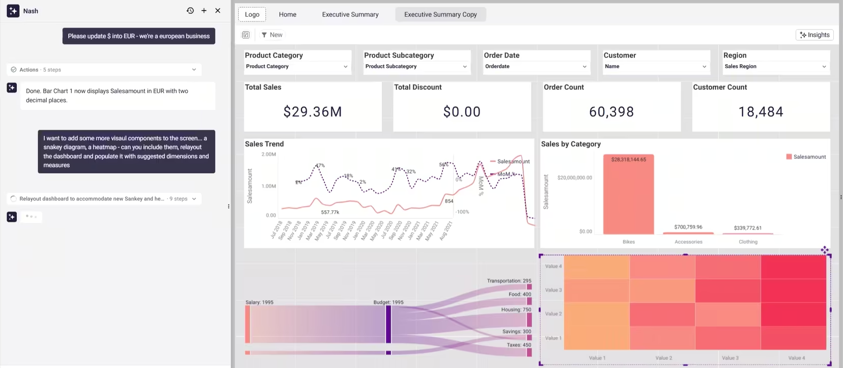
The business value: the boring, error-prone maintenance work that quietly eats a BI team's week becomes a single instruction. This is where an AI dashboard builder earns its place beyond the first build: most of a dashboard's life is spent being edited, not created, and bulk changes are where the hours actually go.
3. Add advanced chart types by name — without configuring them
The pain: adding a less common visualization — a Sankey diagram, a heatmap — usually means creating the chart, then manually wiring it to the right dimensions and measures, then fitting it into a layout that wasn't designed around it.
What Nash does: request the visual by name. "Add a Sankey diagram for category flow and a heatmap for gross profit, relayout the dashboard, and populate the new charts with suggested dimensions and measures."
Nash reads the existing model, picks appropriate fields without asking you which data to use, builds the charts, and rearranges the page to accommodate them. You can adjust afterward, but most of the time you won't need to.
The business value: the expertise barrier drops. A user who knows they want to see category flow doesn't need to know how to configure a Sankey to get one. The AI dashboard generator handles the mechanical mapping; the human keeps the judgment about what's worth showing.
4. Understand an unfamiliar data model in under a minute
The pain: a new analyst joining a project — or an experienced one opening a model they rarely touch — loses real time just figuring out what's there. Which tables exist, how they're joined, what measures are defined, which ones are trustworthy. Documentation, if it exists, is usually stale.
What Nash does: in the semantic layer, click "Describe my semantic layer" and Nash reads the entire model. It returns a structured summary in plain language — tables and how they group, key relationships, the full measure catalogue, and observations about the model's health. It's not just a list: Nash highlights which tables connect to which, where the join web has gaps, and which measures use time intelligence.
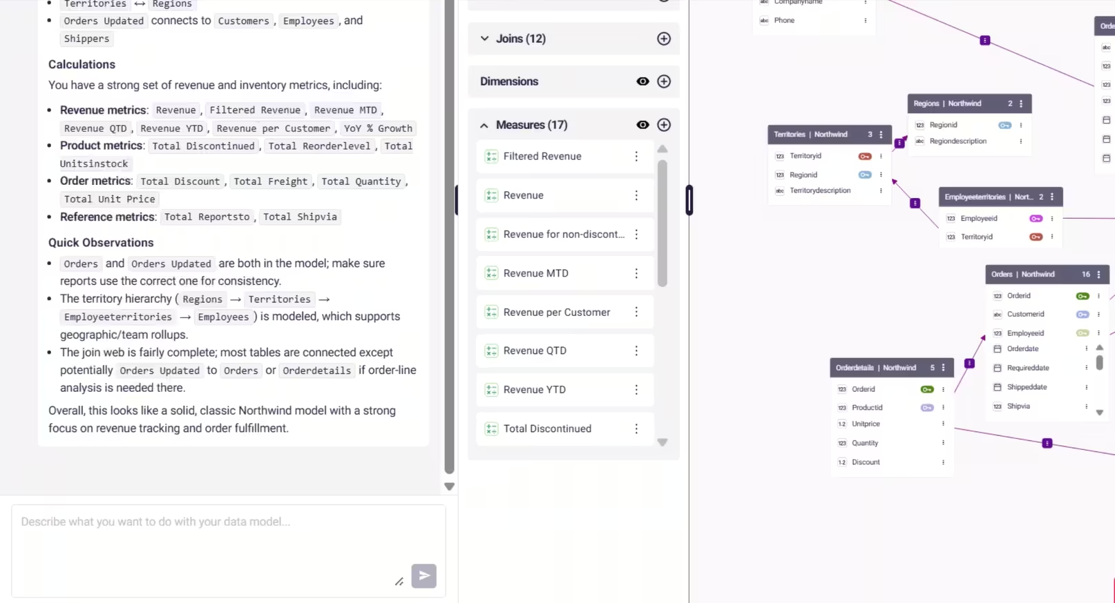
The business value: onboarding that used to take a day of spelunking takes under a minute, with no documentation required. For a data team carrying tribal knowledge in a few people's heads, that's a direct reduction in key-person risk — the model explains itself.
5. Audit your measures and catch inconsistency before it spreads
The pain: semantic layers drift as they grow. Duplicated metrics appear with slightly different definitions. The same KPI gets named three ways across teams. A manual review of hundreds of measures and dimensions would take weeks, so it never happens — and conflicting definitions quietly leak into dashboards downstream.
What Nash does: ask Nash to list all measures with their formula, source table, and meaning, or to give full detail on any specific measure — the logic, the filters, the time intelligence applied.
It groups measures by type (revenue, product, order, time-intelligence) so you can see what you have and spot what's missing, and it flags quick observations like duplicate tables, non-standard aggregations, or incomplete joins.
You can run a consistency review across the full layer and surface exactly where definitions conflict or overlap.
The business value: governance becomes something you can actually maintain at scale instead of an aspiration. Catching a duplicate "net revenue" measure before it ships is far cheaper than reconciling two board decks that disagree.
6. Migrate logic off a legacy BI platform — without rebuilding from scratch
The pain: moving from one BI platform to another is rarely clean. Years of logic built in Power BI DAX, Qlik Set Analysis, Tableau calculations, SQL, or Excel-based reporting don't translate automatically. Teams end up manually recreating every measure, which is slow and reintroduces inconsistency at exactly the moment they're trying to standardize.
What Nash does: describe or paste the existing logic and Nash translates it into the equivalent governed semantic definition inside Astrato. The result lives in the shared layer, not buried in a single workbook. Example prompts that work today:
- “Translate this DAX measure into a semantic metric”
- “Here is a Qlik Set Analysis expression. What is the equivalent in Astrato?”
- “Convert this Excel formula into a governed calculation”
To make the translation concrete — the same metric, "share of tickets by customer," as expressed across three platforms that Nash reads and converts into a governed Astrato measure:
The business value: migration and modernization initiatives accelerate while the trusted business definitions teams built over years are preserved rather than re-derived. This is the use case with the clearest financial stakes — platform migrations are where BI budgets and timelines go to die, and translating logic by conversation removes the single most manual part of the job.
7. Define new metrics in plain language
The pain: someone who needs a metric often knows exactly what they want to measure but not how to express it in SQL or a BI-specific calculation language. So it becomes a development ticket, and a queue.
What Nash does: describe the metric in natural language and Nash produces the semantic definition. "Create a churn rate metric." "Define active customers as customers purchasing within the last 90 days." "Create gross margin by product category." Nash can also build more complex time-intelligence measures — YTD, MTD, YoY. The output is a reusable, governed measure that lives in the shared layer, not a one-off formula trapped in a single workbook.
The business value: metric creation becomes a conversation instead of a ticket. The definition is reusable and consistent the moment it's created, which keeps the semantic layer growing in a governed way rather than fragmenting every time someone needs a new number.
Why a grounded AI dashboard builder stays trustworthy
The thread running through all seven is that Nash works through your governed semantic model, not around it. Every chart it builds and every measure it writes is grounded in the data model you already defined, so suggestions stay accurate and in sync.
Because it reads your live model, it suggests appropriate measures and dimensions for every visual instead of inventing them. And every action is shown as an explicit, transparent step in the panel, so you can see exactly what it's doing and why — then review, edit, and ship under your own sign-off.
That's the line between an AI dashboard builder that's a demo toy and one that survives in an enterprise. Speed is easy. Speed grounded in definitions your team trusts is the hard part — and the part that determines whether you can actually ship what the AI produces.
What to look for when choosing an AI dashboard builder
If you're evaluating AI dashboard generators — whether against Nash or anything else — a few questions separate the tools you can deploy from the ones that look good only in a demo:
- Does it work through your governance, or around it? An AI that generates dashboards over raw data sources or an uploaded CSV will happily invent a definition. One that runs through a semantic layer can only use the measures, joins, and access rules your team already approved — so it can never show a user data they weren't cleared to see.
- Can you audit what it built? When a number looks wrong, you need to trace exactly which measure or join produced it. If the AI's work is an opaque black box, you can't trust it in front of a board. If every step is explicit and editable, you can.
- Does it edit at scale, or only create? First builds are the easy part. The real cost of analytics is maintenance — restyling, reformatting, swapping measures across many visuals. A tool that only generates the first draft leaves the expensive 80% on your plate.
- Who stays in control? The output should be a starting point you refine, not a finished artifact you're stuck with. Look for line-by-line editing, the ability to steer or stop a build mid-flight, and a normal review-and-publish path before anything reaches production users.
Measured against those questions, the useful AI dashboard builders are the ones that treat speed as necessary but not sufficient. Generating an interactive dashboard in seconds is table stakes now. Generating one you can actually ship — grounded, auditable, and yours to refine — is the part that's hard.
See it on your own model
The fastest way to judge any AI dashboard builder is to point it at a model you know well and check whether you'd actually ship what it produces.
Open Nash in a workbook, describe a dashboard you've built by hand before, and compare.
Then open it in the semantic layer and ask it to describe your model — the quality of that summary tells you how well any AI grounded in your data is going to perform.
That test says more than any feature list, including this one.
Ready to experience next-gen analytics?
See how Astrato runs natively in your warehouse.